
Mahjong Typeface and Editorial Design
A typography and editorial design project that translates Mahjong visual language into a contemporary type system and zine layout.
Project Info
Type
Typography / Editorial Design
Context
Undergraduate project
Role
Typeface design, layout design, visual concept
Tools
Adobe Illustrator, InDesign
Concept
Design Approach
This project explores the visual and cultural language of Mahjong, a traditional Chinese game, and reinterprets it through contemporary typography and editorial design. The aim was to translate the symbolic forms and spatial logic of Mahjong tiles into a usable type system while maintaining cultural references.
The design process focused on abstracting key visual elements from Mahjong tiles, including structure, repetition, and modular composition. I experimented with layered and three-dimensional typography to reflect the physical stacking and spatial arrangement of Mahjong pieces. High-contrast colours were used to evoke the visual identity of Mahjong tables and tiles, while maintaining legibility within a typographic system.
Process
Brainstorming
Initial explorations focused on identifying key visual characteristics of Mahjong tiles and how they could inform letterforms.

Typeface Development
Typeface Development
A custom type system was developed based on modular forms and repeated structures.
Editorial Layout
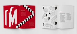
The typeface was applied to a zine format, exploring hierarchy, rhythm, and page composition.


Outcome
The final outcome includes a custom typeface, a series of typographic posters, and a zine layout demonstrating how the system can be applied across different formats.


Reflection
This project helped me understand how cultural elements can be translated into visual systems rather than simply referenced. I learned to move beyond direct imitation and focus on abstraction, structure, and consistency when designing a typeface. The process also strengthened my skills in layout and editorial design, particularly in creating hierarchy and rhythm across pages. Looking back, the project could be improved by testing readability more rigorously and refining the balance between expression and usability. It remains an important project in demonstrating my foundation in typography, visual composition, and cultural translation in design.
 |  |  |  |
|---|